
CAPITAL ADVENTURE CAMP: A SUMMER TO REMEMBER
EXCITING AND ENRICHING SUMMER EXPERIENCES FOR CHILDREN IN WASHINGTON, DC
-
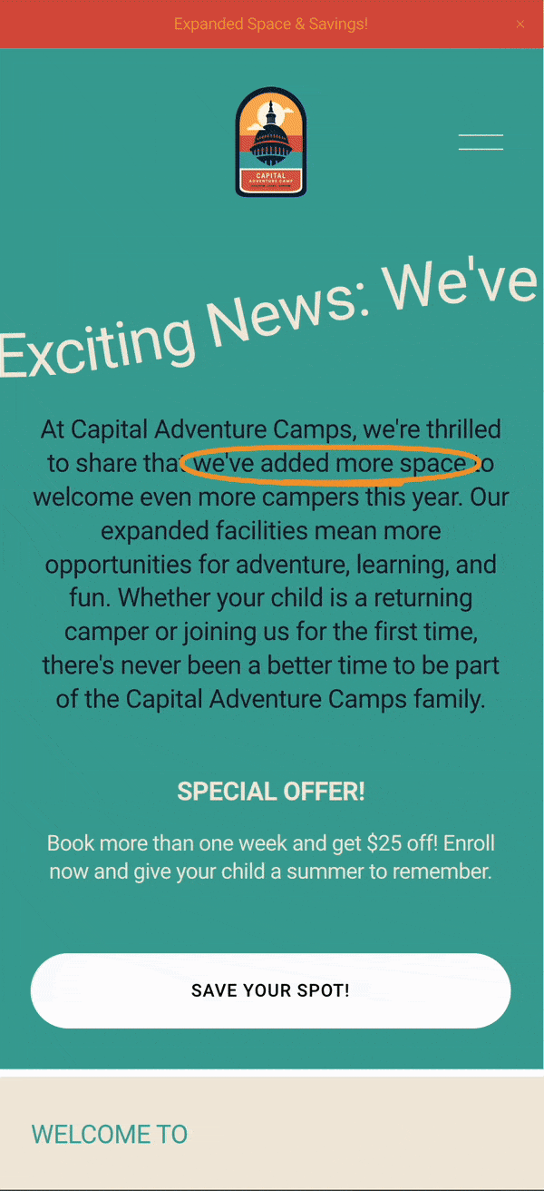
Located in the heart of Washington, DC, Capital Adventure Camps offer an exciting and enriching summer experience for children ages 7-13. Our diverse range of activities is designed to engage, educate, and entertain, ensuring every camper has an unforgettable adventure. From reading and writing workshops to aquatics and robotics, the program is crafted to provide a well-rounded and immersive experience for every child.
-
The goal was to create a comprehensive and engaging summer camp program that fosters learning, creativity, and physical activity in a safe and supportive environment. The project required a quick turnaround to meet the deadline of a late launch, with an aggressive grassroots marketing strategy to ensure maximum visibility and enrollment. The branding aimed to evoke the spirit of adventure and nature, reminiscent of camping badges and inspired by the redwood forests of the West Coast, reflecting the founder's origins.
-
To achieve these goals, we developed a strategic and cohesive branding and marketing plan that highlighted the essence of Capital Adventure Camps:
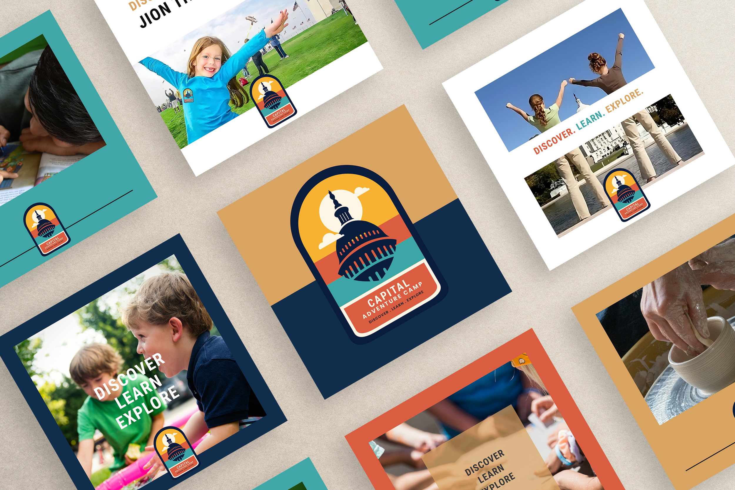
BRANDING AND LOGO DESIGN We designed a unique logo that embodies the spirit of adventure and learning, drawing inspiration from camping badges. The color palette, a nod to the redwood forests of the West Coast, includes earthy tones and vibrant accents that convey a sense of nature and exploration. This thoughtful design approach ensured that the logo was not only visually appealing but also resonated with the camp's core values.
WEBSITE WITH SEO The website was crafted to provide an immersive digital experience, optimized for search engines to enhance online visibility. Key features include a bilingual toggle for accessibility, a booking and scheduling system, and a secure payment platform. The design is light and airy, allowing the rich photography to take center stage, and includes custom favicons for a polished look. The user journey was thoughtfully considered, ensuring an intuitive and engaging experience for parents and campers alike. Additionally, website images were designed to look like nostalgic photographs, leaning into the theme of West Coast camping meets DC day camp.
SOCIAL MEDIA CONTENT AND MARKETING MATERIALS Engaging social media content was developed to keep parents and the community informed and involved. Eye-catching flyers and other marketing materials were created to promote the camp's activities. The marketing strategy focused on grassroots efforts, leveraging social media referrals and community engagement to maximize reach and enrollment.
CUSTOM T-SHIRTS AND UNIFORMS We designed custom camp t-shirts that foster a sense of belonging and team spirit among the campers. The uniforms include name tags where counselors can write their names and pronouns, adding a personal touch. This approach ensures that every interaction between counselors and campers feels personalized and welcoming.
REUSABLE TOTES AND REFERRAL GIFTS Eco-friendly reusable tote bags were created for campers, promoting sustainability. These totes are sold as merchandise and offered as a free referral gift for campers who sign up through a counselor's social media referral, encouraging community participation and rewarding engagement.
PAYMENT PLATFORM SETUP A secure and user-friendly payment platform was implemented for easy registration and payments, ensuring a seamless experience for parents. This feature was crucial in providing a hassle-free enrollment process, contributing to the camp's overall efficiency.
TYPOGRAPHY AND CUSTOM ICONS Unique typography and custom icons were developed to create a cohesive and visually appealing brand identity. These elements are used across all marketing materials, enhancing the camp's visual coherence and professionalism.
COLOR PALETTE The vibrant and inviting color palette reflects the energy and excitement of the camp. Inspired by the redwood forests of the West Coast, the colors convey a sense of nature, adventure, and exploration, aligning with the camp's mission and values.
LOGO DESIGN: EMBODYING ADVENTURE AND LEARNING
A UNIQUE AND INSPIRING BRAND IDENTITY
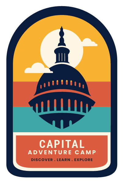
KEY FEATURES:
-
The logo design draws inspiration from traditional camping badges, capturing the spirit of adventure and exploration that is central to Capital Adventure Camps.
-
The color palette reflects the founder's roots in the redwood forests of the West Coast, using earthy tones and vibrant accents to evoke a sense of nature and discovery.
-
Every element of the logo was carefully crafted to ensure it resonated with the camp's core values of learning, creativity, and adventure. The design includes elements such as trees, mountains, and outdoor symbols, contributing to a cohesive and memorable brand identity.
-
The logo is designed to be versatile, suitable for use across various mediums including websites, t-shirts, uniforms, and marketing materials, ensuring consistent branding throughout all camp-related materials.
-
The logo strikes a balance between professionalism and fun, appealing to both children and parents, and reinforcing the camp's commitment to providing an enriching and enjoyable summer experience.
WEBSITE DESIGN: AN IMMERSIVE ONLINE EXPERIENCE

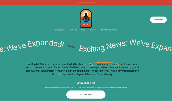
CRAFTING A DIGITAL PLATFORM THAT ENGAGES AND INFORMS

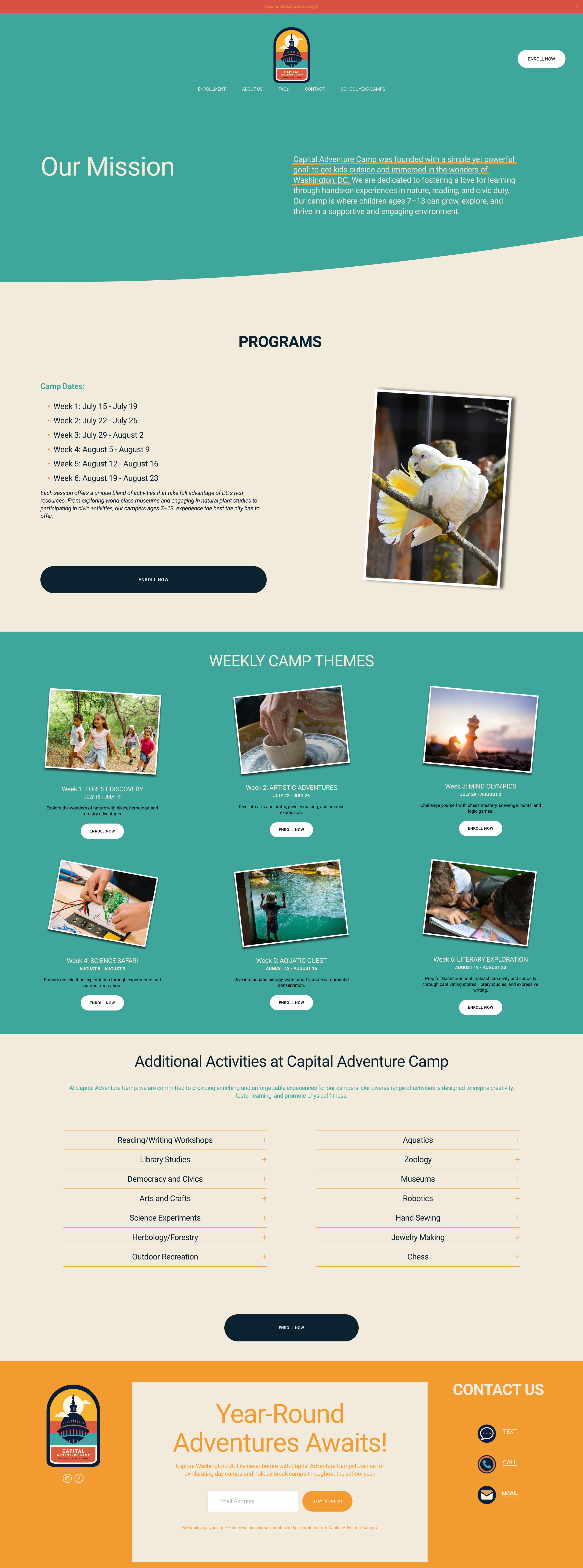

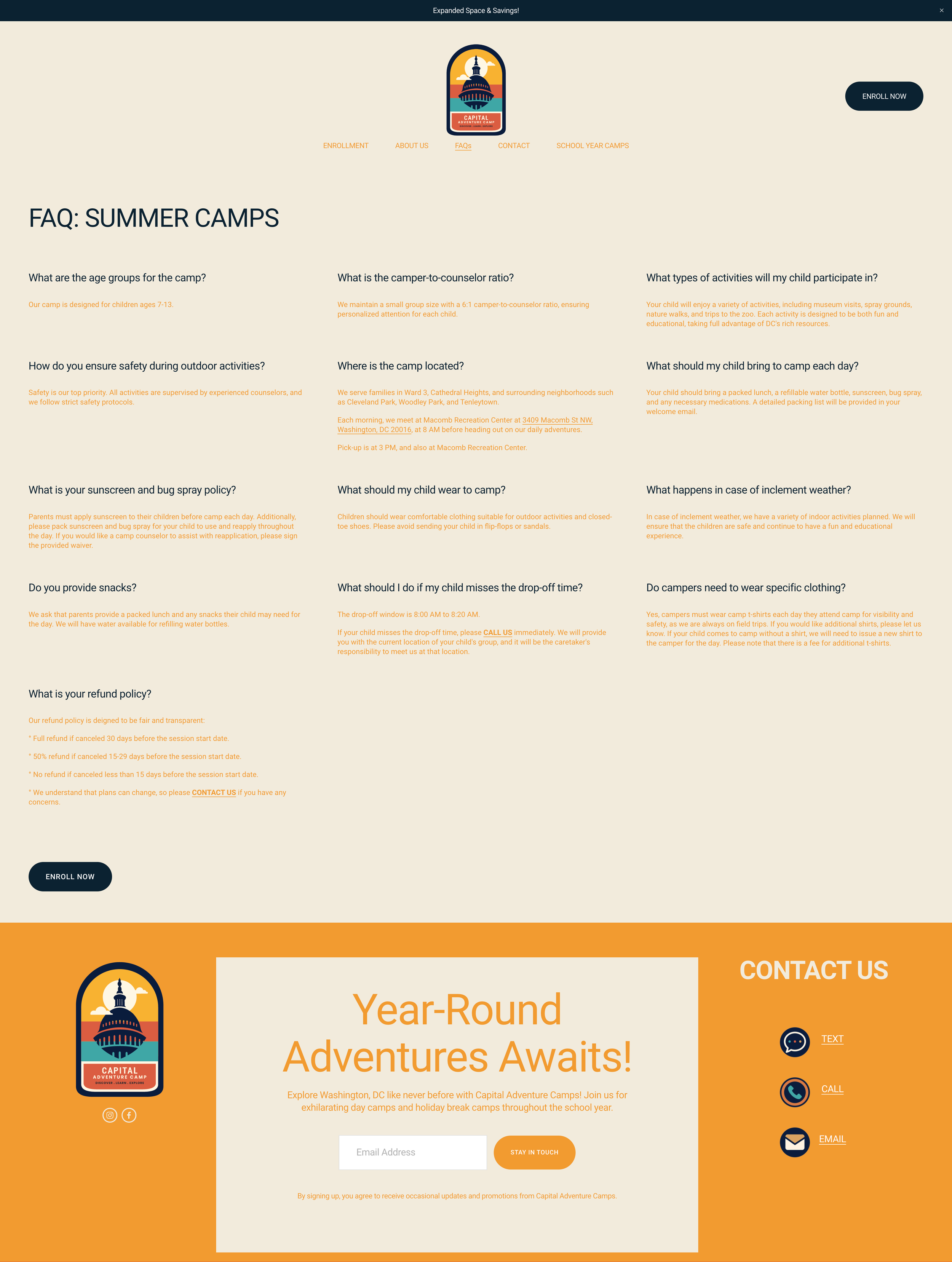

KEY FEATURES:
-
The website design features images styled to look like nostalgic photographs, leaning into the theme of camping on the West Coast while blending with the essence of a DC day camp. This design choice creates a warm, inviting atmosphere that resonates with both parents and children.
-
The website offers an intuitive and engaging user journey. Key features include easy navigation, clear information about the camp’s activities and schedule, and straightforward registration and payment processes.
-
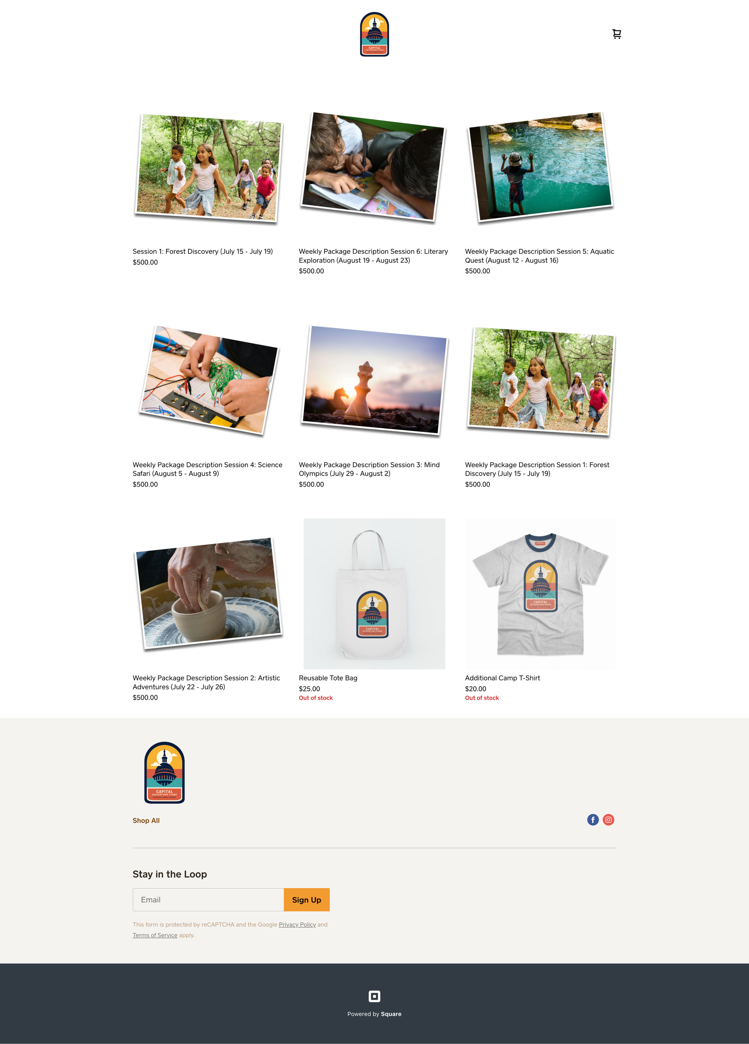
Parents can easily purchase camp weeks through the website. The straightforward process allows them to select the weeks their children will attend, making registration simple and hassle-free.
-
The website includes an option to buy camp t-shirts and totes. This feature allows parents to purchase camp merchandise conveniently, enhancing the overall camp experience.
-
The website includes a secure payment platform for easy and hassle-free transactions. Returning customers can create profiles, making future bookings and payments more efficient. Additionally, a customer portal allows parents to manage their registrations, payments, and camper information all in one place.
-
To enhance online visibility and attract more visitors, the website is optimized for search engines. This includes using relevant keywords, creating high-quality content, and ensuring the website is mobile-friendly.
-
The website's design reflects the camp's branding, using the same color palette, typography, and logo. This consistency reinforces the camp's identity and ensures a cohesive experience across all touchpoints.
BOOKING FEATURE: STREAMLINING CAMP REGISTRATIONS

-
The booking and scheduling system on the Its a Breeze Movers website is designed for ease of use and convenience:
Simple Navigation: Customers can effortlessly browse available services and select the ones they need.
Real-Time Availability: The system displays real-time availability, allowing customers to choose dates and times that best suit their schedule.
-
Parents can easily select and purchase camp weeks directly through the website. The user-friendly interface allows them to view available weeks, choose their preferred dates, and complete the booking with just a few clicks.
-
The booking system offers flexible purchase options, allowing parents to customize their child’s camp experience. They can select specific weeks that fit their schedule, making it convenient to plan around other commitments during the summer.
-
Integrated with a secure payment platform, the booking feature ensures safe and efficient transactions. Parents can make payments online, eliminating the need for manual processing and providing instant confirmation of their bookings.
-
The booking system seamlessly integrates with the website’s overall design and functionality. It maintains consistency with the camp’s branding, using the same color scheme, typography, and visual elements to create a cohesive user experience.
-
Returning customers can create profiles within the customer portal, enabling them to manage bookings, view payment history, and update camper information at any time. This feature enhances user control and simplifies future interactions with the camp.
-
The booking feature is fully optimized for mobile devices, ensuring that parents can easily access and navigate the website from their smartphones or tablets. This mobile-friendly design enhances accessibility and convenience for busy parents on the go.
KEY FEATURES:
MOBILE OPTIMIZATION: ACCESSIBILITY ON THE GO

INSTAGRAM ASSETS: CREATING ENGAGING VISUAL CONTENT


-
Custom graphics were created to promote upcoming events, registration deadlines, and special promotions. These assets are designed to grab attention and encourage followers to take action.
-
We crafted a hashtag strategy to increase the visibility of posts and encourage user-generated content. Custom hashtags help to build a community around the camp’s social media presence and make it easier for followers to find related content.
-
Graphics were created for key announcements such as new activity launches, special guest appearances, and important dates. These visually appealing assets ensure that important information is communicated effectively.
-
We designed a series of branded templates for Instagram posts and stories. These templates feature the camp’s color palette, typography, and logo, ensuring a cohesive and professional look. Templates include announcements, activity highlights, camper spotlights, and promotional offers.
KEY FEATURES:
CUSTOM FAVICON: BRANDING AND RECOGNITION

-
A unique and easily identifiable icon representing the Its a Breeze Movers brand.
-
Improves visibility in browser tabs, bookmarks, and search results.
KEY FEATURES:
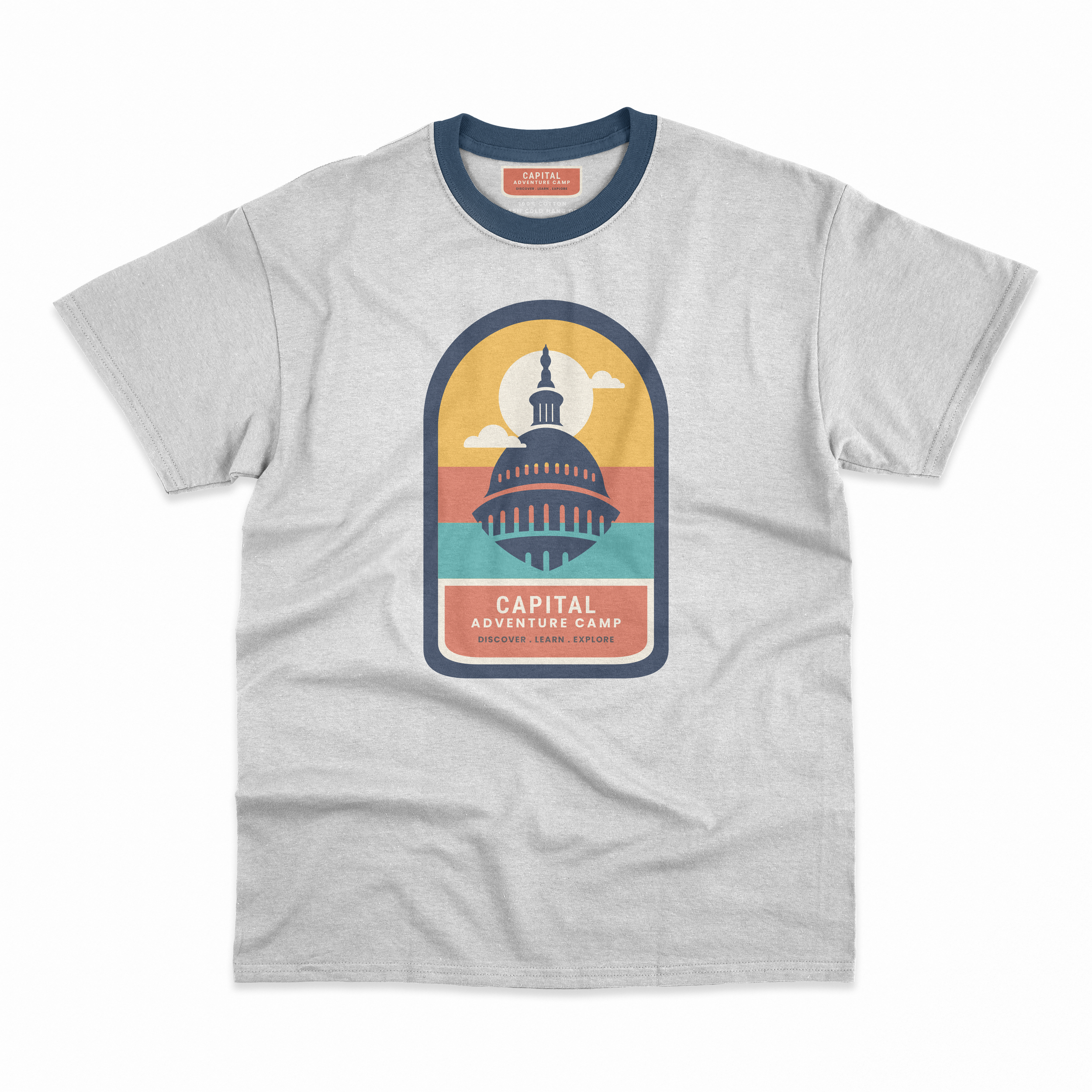
CUSTOM TOTE BAGS AND T-SHIRTS: ENHANCING CAMP SPIRIT


As part of the Capital Adventure Camps project, we created custom tote bags and T-shirts to embody the camp's adventurous spirit and cohesive branding. These items serve both functional and promotional purposes, reinforcing the camp's identity and providing tangible takeaways for campers.
KEY FEATURES:
-
The durable materials ensure that both the tote bags and T-shirts can withstand the rigors of camp life, providing long-lasting use and value.
-
The designs are vibrant and engaging, capturing the adventurous spirit of Capital Adventure Camps and making them attractive to both campers and staff.
-
Both the tote bags and T-shirts incorporate the camp’s logo and color palette, ensuring a consistent brand identity across all merchandise.
Explore More Work…
-
![]()
HIRSCHHORN
-
![]()
GEICO REFRESH
-
![]()
ITS A BREEZE MOVERS
-
![]()
GEICO | NFL
-
![]()
AVRIEL'S FRAGRANCES
-
![]()
GEICO | FIFA
-
![]()
HOLIDAY
-
![]()
GEICO | MLB
-
![]()
GEICO | NASCAR
-
![]()
GEICO | NETFLIX
-
![]()
YELLOW TAG
-
![]()
ROSÉ
-
![]()
VALENTINE'S DAY CAMPAIGN
-
![]()
THREE BIRDS HARD SELTZER
-
![]()
ARROW'S PIZZA
-
![]()
CIGAR TIN
-
![]()
WHITE WALKER BY JOHNNIE WALKER
-
![]()
ORGANIC WINES
-
![]()
TOTAL WINE'S NEW DELIVERY


Explore Our: SERVICES
-
![]()
508 Compliance for Websites and PDFs
Achieve full digital accessibility with our comprehensive 508 compliance services.
-
![]()
SEO and Digital Marketing
Skyrocket your online visibility with our sustainable SEO and digital marketing strategies.
-
![]()
Responsive Web Design & Development
Transform your online presence with our responsive, energy-efficient web design.
-
![Visual Communication]()
Visual Communication
Communicate your message powerfully with our eco-conscious visual communication services.
-
![]()
Content Creation
Engage your audience with clear, impactful content that’s also environmentally responsible.
-
![]()
Education Design
Empower your team with our inclusive and sustainable education design services.
-
![]()
Event Design
Host unforgettable, sustainable events that leave a lasting impression.
-
![]()
Consulting Services
Elevate your organization with our expert consulting services.
-
![]()
Coaching Services
Productivity coaching that empowers entrepreneurs and employees to achieve their goals and maximize efficiency.
-
![]()
Photography
Capture stunning visuals with our sustainable photography services.
-
![]()
Branding and Corporate Identity
Transform your brand with Haus5 Lab.Co's eco-conscious branding and corporate identity services.
-
![]()
Our Eco-Promise
Learn about Haus5 Lab.Co's commitment to sustainability.


GOVERMENT IDENTIFERS
CODES
NAICS
NIGP
UNSPSC
PSC/FSC
CERTIFICATIONS
CERTIFICATIONS
-
WOSB (Women-Owned Small Business)
ISO CERTIFICATIONS
-
-
ISO 9000 - QMS Family & Fundamental Principles
Certification Number: 5276-29939332
-
ISO/IEC 27001 - Dynamics of Information Security Management System (ISMS)
Certification Number: 5276-29939332
BUSINESS SIZE & SOCIO-ECONOMIC
-
Small Business
-
Minority-Owned Business
-
Economically Disadvantaged Women-Owned Small Business (EDWOSB)
-
Certified Business Enterprise Program (CBE) (Pending)
-
Disadvantage Business Enterprise (DBE) (Pending)
